
Logo & Website Design for
Pages in Flight
Pages in Flight is a New Zealand-based editing and proofreading business dedicated to helping writers refine and elevate their work. As part of the project, I designed both the logo and website, creating a cohesive brand identity that reflects the professionalism, creativity, and attention to detail at the heart of the business.
The website was designed to provide a welcoming and informative online presence, guiding authors through the services available while building trust and credibility. Through thoughtful use of imagery, soft colour palettes, and clean typography, the site balances professionalism with warmth, creating an inviting experience for both aspiring and established writers. Clear calls to action and intuitive navigation help visitors easily explore services and make contact.
Website Features
-
9-pages
-
Service Information Pages
-
Interactive Contact Form
Additional Services
-
Logo Design & Brand Development
Logo Design
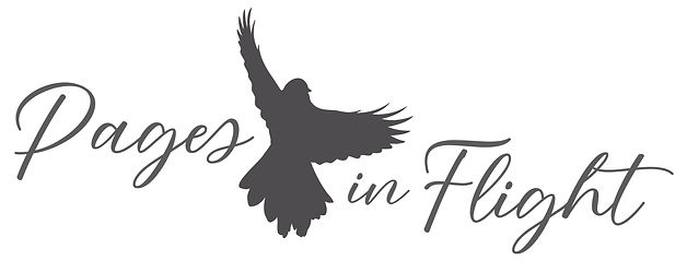
Working closely with the client during a business rebrand, I designed a logo that incorporates the fantail - a symbol that had become an important part of her business identity. The fantail represents the twists and turns, dives and lifts that a manuscript takes throughout its journey from first draft to finished work. This concept inspired both the business name, Pages in Flight, and the visual identity.
The resulting logo combines elegance, movement, and professionalism, reflecting the creative process of writing while conveying the care, expertise, and attention to detail that authors can expect when working with Pages in Flight.